

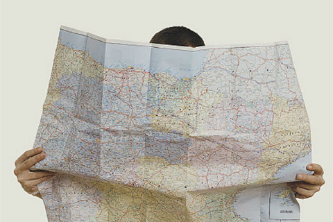
One wall of the boardroom at U of T’s Cities Centre is covered by an intricate, multi-hued map of Greater Toronto. At first glance, it looks like a large version of a typical land-use planning chart. But for geographers André Sorensen and Paul Hess, the giant map represents a highly detailed answer to an elusive riddle: how is land actually being used in the suburbs? “Our primary goal,” says Sorensen, “is to study what we have built over the last 60 years.”
Municipal planning diagrams don’t provide much detail, and the province doesn’t make its land-use data available to researchers. As well, zoning and approved uses for a particular site don’t necessarily correspond to what ended up being built there.
To fill the void of accurate data, Sorensen and Hess recruited about three dozen students to meticulously code the actual land uses on each piece of property across the GTA. (They excluded parts of downtown Toronto because large buildings often contain multiple uses, and are difficult to classify). Their research tool: Google Street View, which allows users to zoom in and “see” what’s happening at ground level in every nook and cranny of the city. “It’s very laborious,” admits Sorensen, noting that in three years the team has coded five million parcels of land; the analysis will continue for another two years. The aim is to create a baseline, and then update it every five years in tandem with the census.
Once complete, the project will yield a far more detailed map of land use in the GTA than has ever been publicly available. What’s more, by cataloguing what’s actually taken root in post-war subdivisions and combining this information with census data and zoning rules, Sorensen and Hess believe they will develop a much keener understanding of what kinds of planning policies yielded the sorts of compact, mixed-used communities that are still rare in suburban municipalities. “We’re still building the dream city of the 1950s,” muses Sorensen. “There are places where this pattern was changed, and we’re looking at why.”

The area around the intersection of Yonge and Eglinton shows the pre-WW2 pattern of urban development, in which small-scale land subdividers simply extended the grid of streets and sold off land parcels to builders who built houses a few at a time. This pattern creates a very pedestrian friendly pattern with lots of street connections, and allows incremental redevelopment and intensification to occur. Retail is found along main streets such as Yonge, Eglinton and Bayview that had public transit.

This area east of the Don Valley Parkway and north of Lawrence shows clearly the dramatic change in development patterns before and after WW2. East of Victoria Park is essentially a pre-war pattern with major streets following the pattern of farms, with a simple grid created by land subdividers, cut across by major infrastructure such as railways and electric transmission corridors. West of Victoria Park, the new pattern of master planned developments in neighbourhood units, curvy streets and cul-de-sacs, and a mix of housing types, including apartments, townhouses and semi-detached houses. Retail is moved to small plazas in the centre and corners of the superblock, instead of in strips along the arterial roads. More park space is preserved.
Recent Posts
For Greener Buildings, We Need to Rethink How We Construct Them
To meet its pledge to be carbon neutral by 2050, Canada needs to cut emissions from the construction industry. Architecture prof Kelly Doran has ideas
U of T’s 197th Birthday Quiz
Test your knowledge of all things U of T in honour of the university’s 197th anniversary on March 15!

Are Cold Plunges Good for You?
Research suggests they are, in three ways