

All photos by Polina Teif
Campus
We’re Going to Print Like It’s 1899
Having grown up with all things digital, these students are learning how to make books the old, old-fashioned way
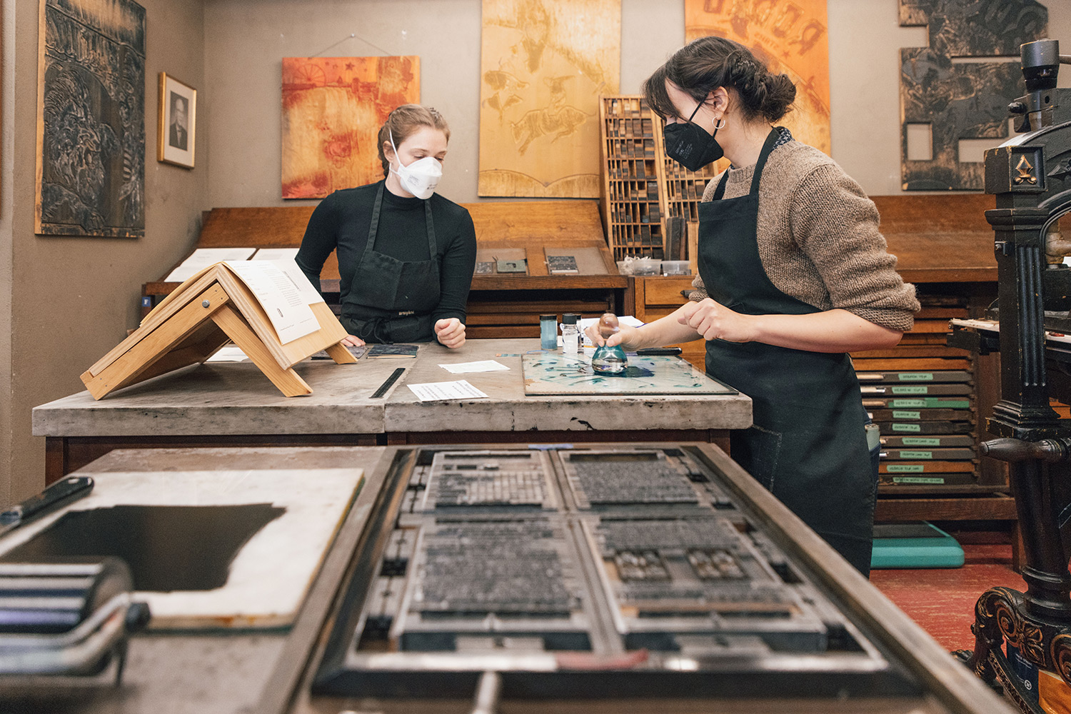
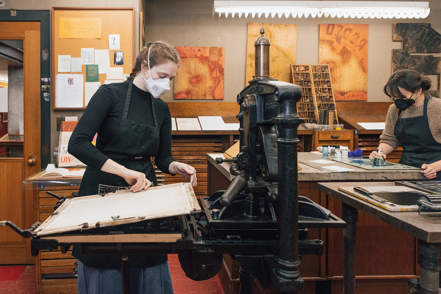
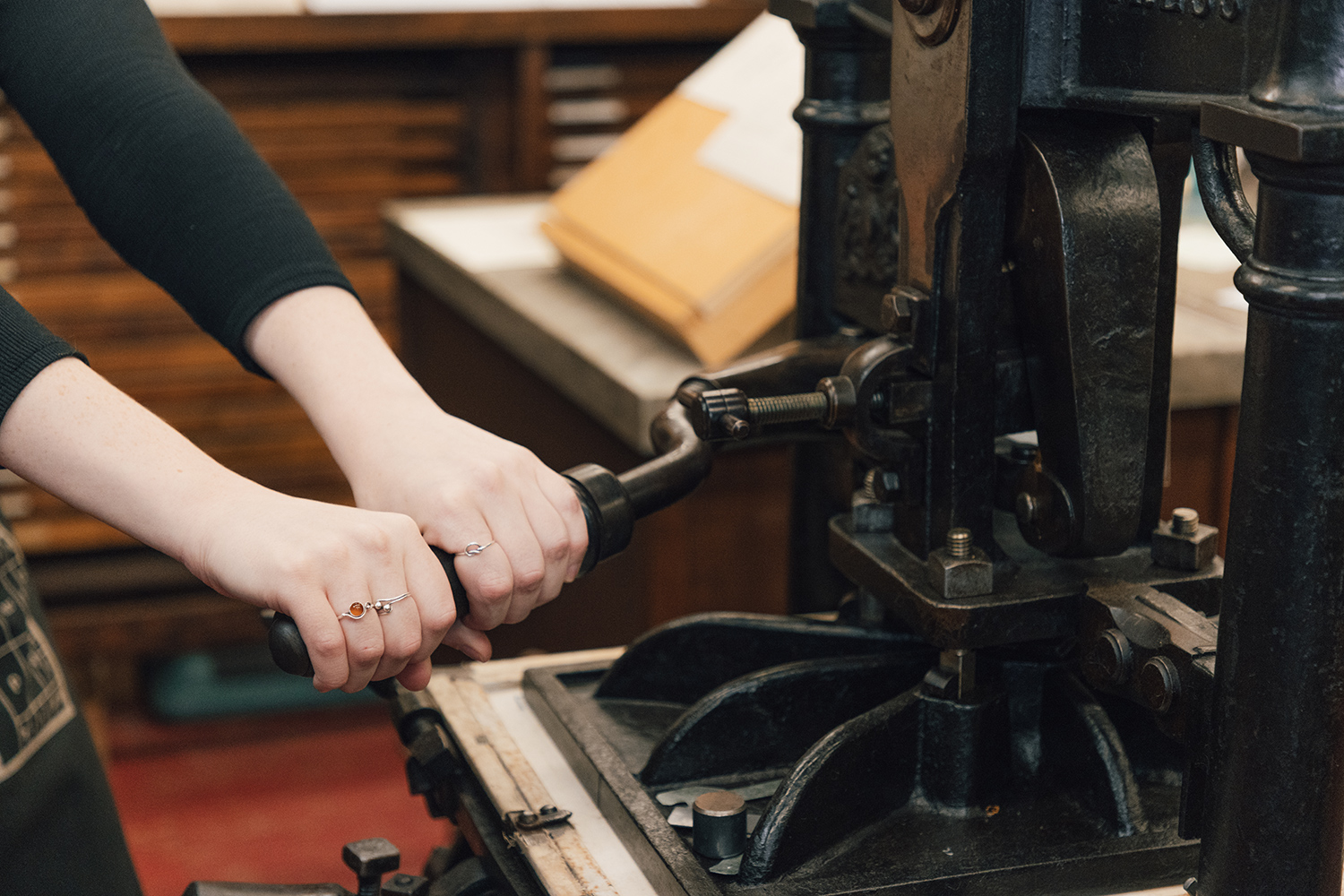
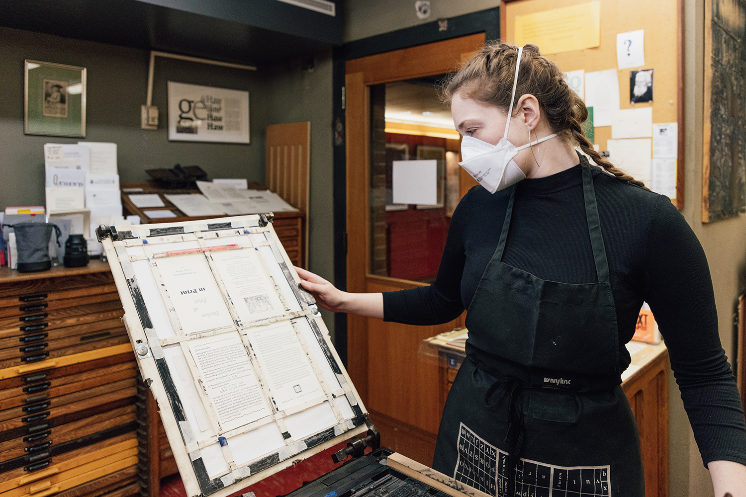
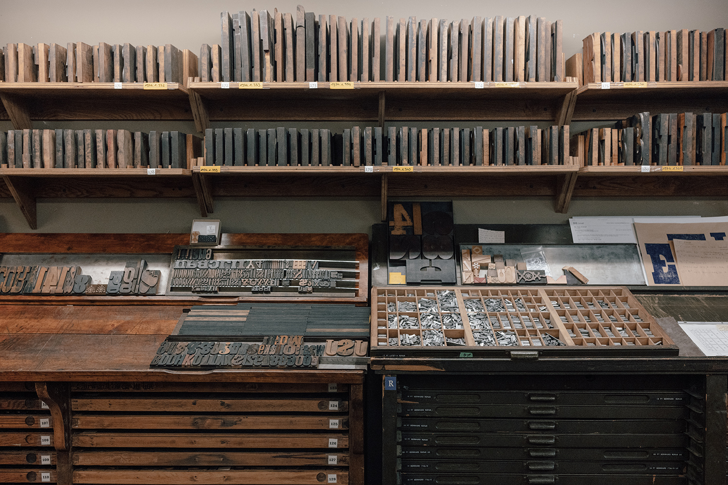
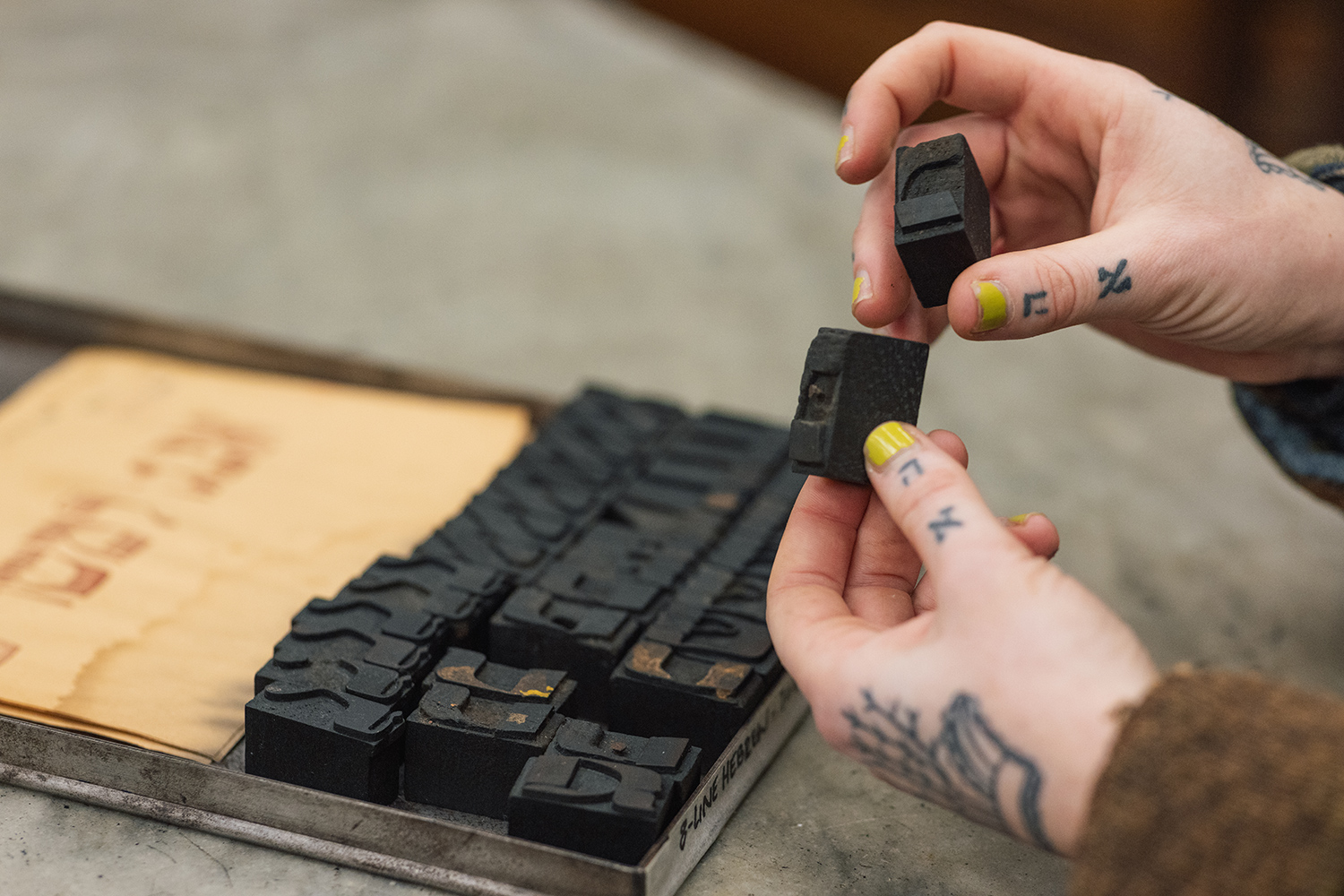
At a time when books are increasingly downloaded, some U of T graduate students are learning how to create traditional printed volumes – using 19th century letterpresses and a large collection of wood and metal type in the Bibliography Room at Massey College.
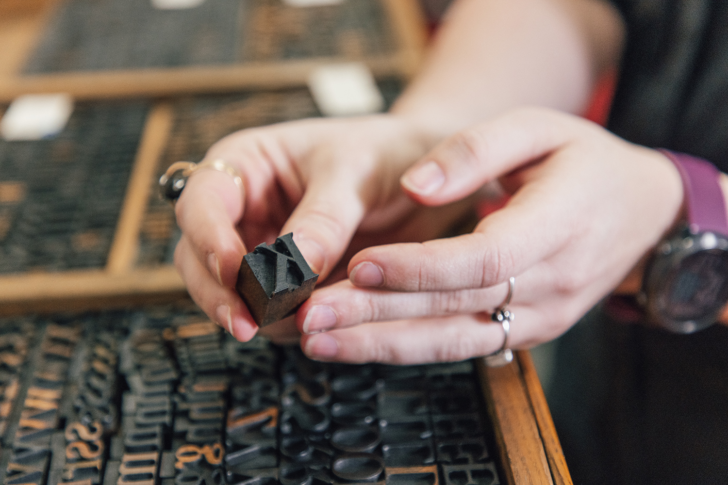
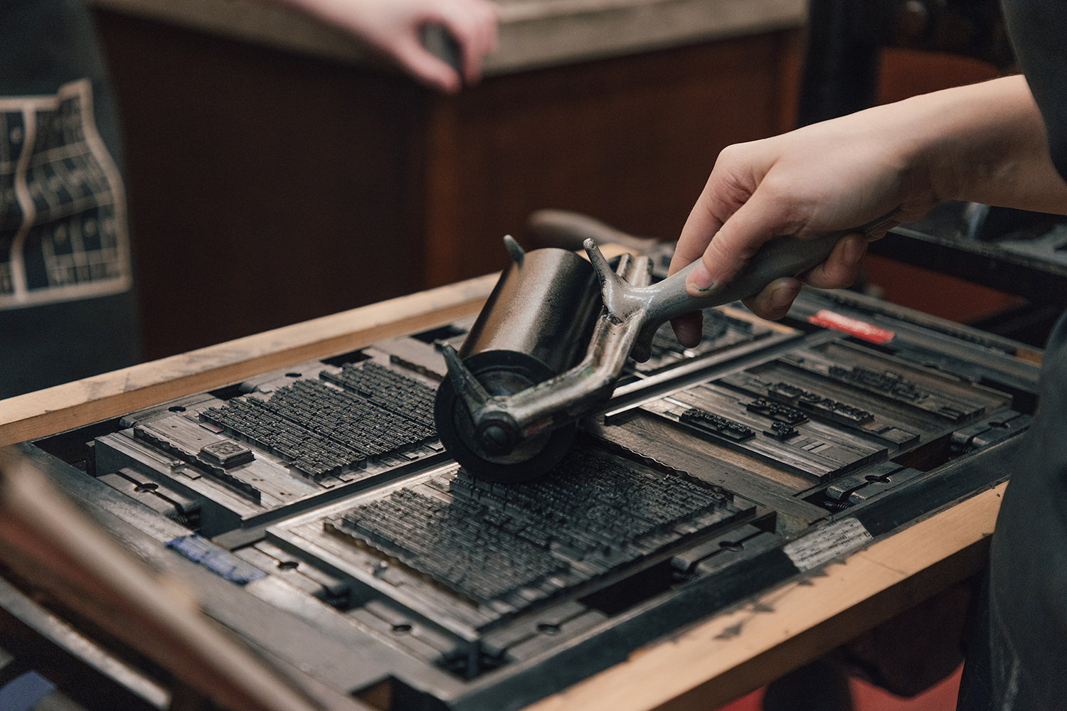
The students come from a variety of disciplines but are all interested in the history of the book. They say the hands-on experience of painstakingly setting type and mechanically printing a single sheet at a time sometimes takes their studies in new directions – and encourages them to use their brain differently.
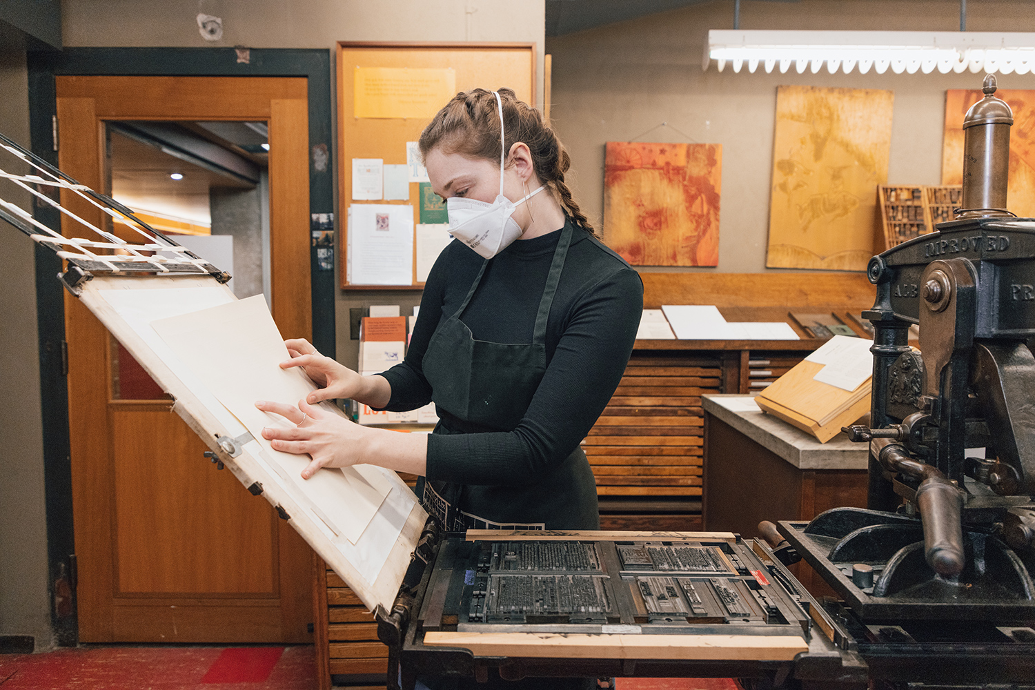
“The slow pace of letterpress printing allows for a more thoughtful creative process and lets me demonstrate an artistry I didn’t think I possessed,” says Kathryn Middleton, a Master of Information student and one of three designated Printing Fellows working in the Bibliography Room this term, as part of the Book History and Print Culture program.
Most Popular

Fuel for Dreams
Six students share how U of T financial support made university more affordable – and what became possible as a result Read More

Advance Justice for Indigenous Peoples
A decade after the Truth and Reconciliation Commission’s Calls to Action, U of T experts weigh the gains, the gaps and the next steps Read More

Learning to Think –
or Learning to Prompt?
As AI reshapes what’s possible, 10 U of T students reflect on what university is for Read More
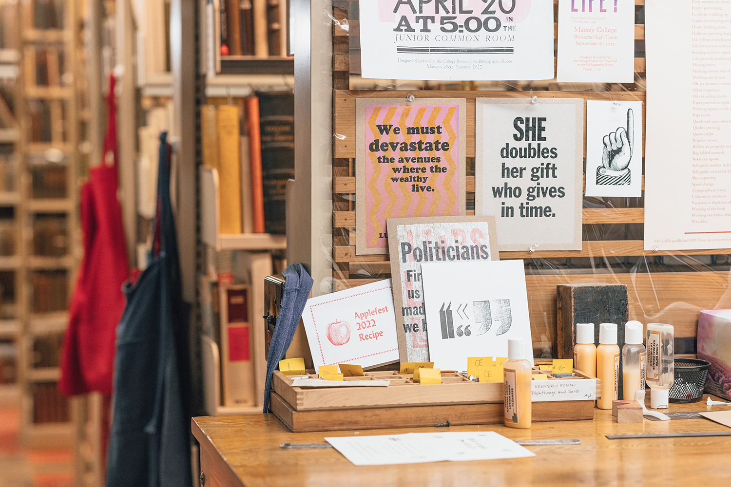
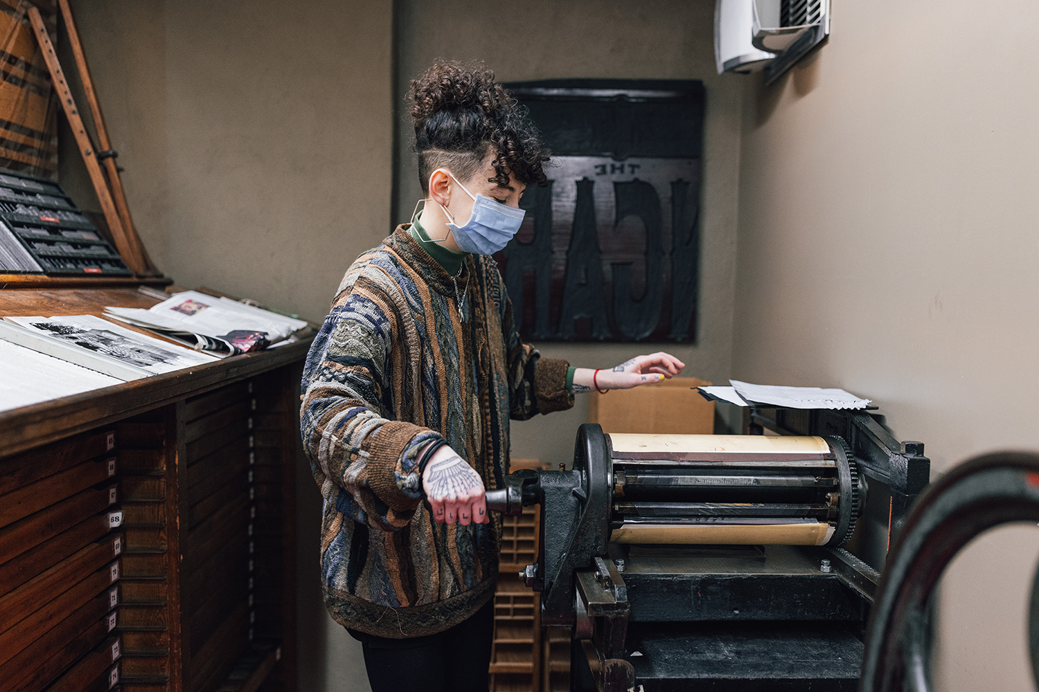
One of the purposes of the program, says director Yulia Ryzhik, an assistant professor in the department of English at U of T Scarborough, is to get students from various disciplines thinking critically and analytically about the physical nature of the book and the implications of how books are made and distributed. This involves everything from examining manuscripts and marginalia to typography and book binding to paper- and ink-making.

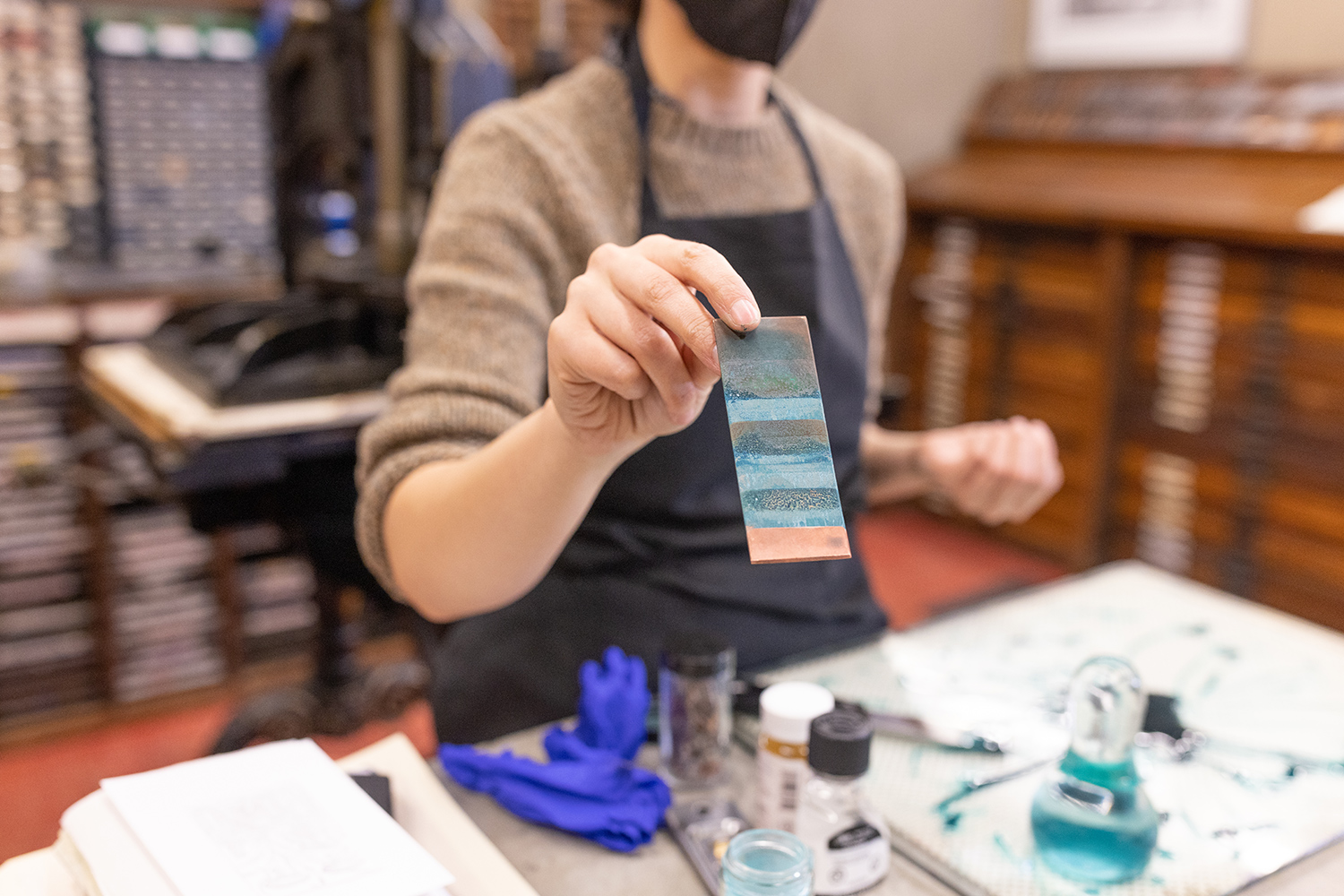
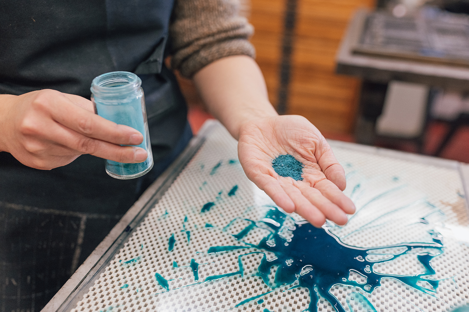
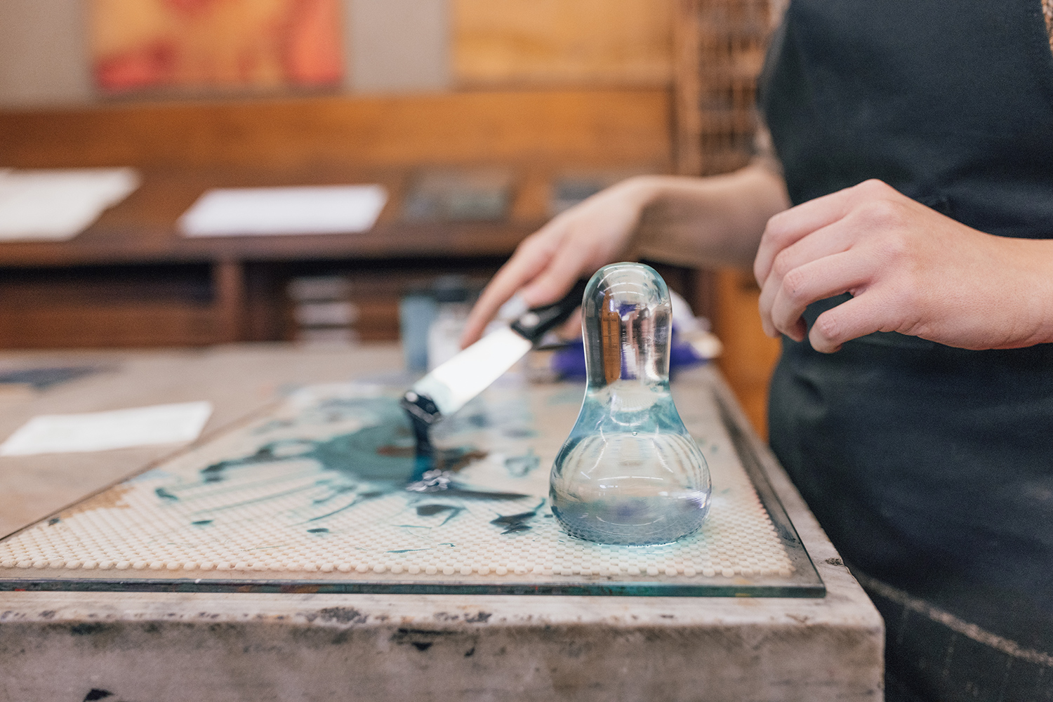
Adriana Ciocci, a PhD candidate at the Institute for the History and Philosophy of Science and Technology and also a Printing Fellow, is making her own verdigris ink using a 17th-century recipe. She says finding an ink recipe from the era was difficult because print shops fiercely guarded these formulations – as food companies today would a “secret sauce.”
She likens the diverse group of students and professors who use the Bibliography Room – under the expert guidance of college printer Kit MacNeil – to an artist studio: “an environment that encourages experimentation while acknowledging the inevitability of making errors while learning.”
Most Popular
Learning to Think –
or Learning to Prompt?
As AI reshapes what’s possible, 10 U of T students reflect on what university is for Read More
Fuel for Dreams
Six students share how U of T financial support made university more affordable – and what became possible as a result Read More
Advance Justice for Indigenous Peoples
A decade after the Truth and Reconciliation Commission’s Calls to Action, U of T experts weigh the gains, the gaps and the next steps Read More
Sophie Edelhart, a PhD candidate in Yiddish Studies and a Printing Fellow, is making a Haggadah – a book that sets out the order of the Passover Seder – using Yiddish type acquired from a Jewish newspaper in Hamilton, Ontario.
Edelhart says the process of typesetting and binding the Haggadah, which they hoped to use at their own Passover celebration, has given them a deeper appreciation for books as objects and introduced them to a craft that they now consider a passion. “I really value having a space where every week I get to walk in and just be creative.”
Most Popular
Learning to Think –
or Learning to Prompt?
As AI reshapes what’s possible, 10 U of T students reflect on what university is for Read More
Advance Justice for Indigenous Peoples
A decade after the Truth and Reconciliation Commission’s Calls to Action, U of T experts weigh the gains, the gaps and the next steps Read More
Fuel for Dreams
Six students share how U of T financial support made university more affordable – and what became possible as a result Read More
The experience of being a Printing Fellow sometimes takes the students outside the Bibliography Room together. The group visits historical book shops, attends book fairs and other events and often catch up outside of Massey College at the Crafty Coyote, a pub on Bloor Street West. “There’s a lot of camaraderie amongst the ‘Bib Roomers,’” says MacNeil.
Most Popular
Fuel for Dreams
Six students share how U of T financial support made university more affordable – and what became possible as a result Read More
Learning to Think –
or Learning to Prompt?
As AI reshapes what’s possible, 10 U of T students reflect on what university is for Read More
Advance Justice for Indigenous Peoples
A decade after the Truth and Reconciliation Commission’s Calls to Action, U of T experts weigh the gains, the gaps and the next steps Read More

No Responses to “ We’re Going to Print Like It’s 1899 ”
I once worked at William Lyon MacKenzie House on Bond Street in Toronto. My job there was to give short lectures about the printing press used by MacKenzie himself, and to demonstrate how it worked. It was extremely interesting!
Having written a dissertation on a 17th-century bishop who published some 250 books, it is great to see print culture given such care in what is thought of as a digital era.
As a Master of Library Science graduate who is now long-retired, I found this article fascinating! Reading suggestion: The Weight of Ink by Rachel Kadish.
I worked for a small publisher in Toronto for many years and spent many inky hours in the proofreading room at the printer. I enjoyed interacting with the printer's staff and with the other customers. We would help each other proofread the final page proofs to catch any errors that may have been missed. I witnessed the shift from hot type (male typographers) to cold type (young women and men). The printer kept a hand press for special projects until they went out of business.
My father oversees a printing museum in a small town in southern Manitoba (Crystal City). Last summer, we were excited to discover Gianni Basso and his printing shop in Venice, Italy. Such an amazing glimpse into Venetian printing history. I highly recommend reading about his background or visiting his stamperia in person!
I took a one-year multimedia program at Algonquin College and I wish we'd had this kind of setup. From the lead-letter pressing, students can learn how to design fonts and everything in between and beyond. Printing and assembling books can be so much fun, and it helps even young learners appreciate printed books. I hope U of T uses this for a "create-a-book workshop" for high school students. This could become a pipeline of creators!
The Bib Room is a treasure! Printing is an art and fundamental to culture. It's wonderful that these techniques have not been not lost in our age. The knowledge of creating the printed page will endure thanks to Massey College.
The printing industry provided a fertile base for the emergence of trade unions in Canada. You had to be literate to work in this field, which contributed to the emergence of a dynamic, articulate movement. The Toronto Printers' Strike of 1872, in which workers sought shorter (nine-hour) workdays, contributed to the legalization of trade unions in Canada. This had repercussions across the country during the Conservative government of Sir John A. Macdonald. The trade union movement grew, and in 1891 the Roman Catholic Church adopted a favourable position toward the working classes in the 1891 encyclical Rerum Novarum.