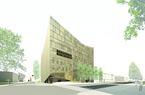
It’s like throwing a dinner party where one of the guests is a famous chef.
When Nader Tehrani and Monica Ponce de Leon tackled the challenge of re-imagining the squat red-brick structure that houses the John H. Daniels Faculty of Architecture, Landscape and Design, the principals of Office dA/Adamson Associates in Boston knew they would be working with their “greatest collaborators and fiercest critics,” as Tehrani puts it. So the pressure was on.
For almost two decades, the 46-year-old designer has worked regularly with some of the U of T faculty’s leading figures, including George Baird and Bridget Shim. This commission – for an overhaul funded in part by a major donation – held out a special challenge, both because of the faculty’s prominent location at the south-west corner of the St. George campus, and the building’s limitations as a teaching space.
“The offering of a new identity for the school is an important thing but not the only thing,” says Tehrani, who also teaches urbanism at the Massachusetts Institute of Technology. “The interior organization is totally re-conceptualized.”
Tehran’s intriguing design has already attracted the attention of the city’s architecture critics. Azure Magazine’s Catherine Osborne describes the vision as “strikingly transformative.” She notes “There’s no better place for a university to push the design envelope than at a school of architecture.”
Meanwhile, the Star’s architecture critic Chris Hume notes that the project runs counter to the usual story of heritage preservation in Toronto, preserving the façade while gutting the interior. “In this case…the emphasis will be on saving the inside and allowing changes to be made on the outside.”
The most obvious element of the OdA design, selected earlier this fall after an international competition, is the proposal to fit a new angular glass and steel façade over the building’s exterior, almost like a helmet. Equipped with energy saving features, this second skin represents a bold makeover for an otherwise unprepossessing five-storey box.
Unlike the institutional structures on either side of it, the Daniels Faculty presses up against the sidewalk and therefore draws attention to itself. “The idea of the building as a threshold is very important,” says Tehrani. “It has a bigger responsibility.” The new exterior, he adds, will give the Daniels building renewed prominence among the workaday structures that line that stretch of College Street.
As with Frank Gehry’s remake of the Art Gallery of Ontario, the most important changes will be to the interior. Tehrani and de Leon want to create a column of double-height open spaces – atriums, studios, staircases, lecture halls – that will fill the building with more light, interesting interior vistas and ample spaces for graduate students to develop studio design projects. The changes will also include a ground-floor auditorium, visible from the street, and a new rooftop library that will feature a curtain wall overlooking the city.
“One of the things we discovered about the faculty is that it’s not the skin that needed to be saved but [rather] the structure and the bones,” says Tehrani. He points out that the studios won’t be like museum galleries but rather “urban” work spaces, where students can tack their drawings to the walls and debate ideas.
The terrace up top will do double-duty, serving both as a green roof and a teaching environment for horticultural experiments and training for landscape architecture students.
As the project progresses, Tehrani will develop a mission statement with an eye to refining the concept. His team is also examining the building’s structural and mechanical systems to make the structure more sustainable. Among the plans: using the new exterior skin to reduce energy costs by as much as 70 per cent and relying on locally sourced building materials or those with a high level of recycled content. The project, moreover, will be staged so the building can continue as a teaching venue – in every sense – for the duration of the construction.
“As an act of preservation, what we’ve done is a surgical intervention,” Tehrani observes. “We wanted a building with a strong identity but one that doesn’t hammer you over the head with it. Not all buildings need to scream.”
True enough, but this one will certainly declare itself.
Read Office dA’s complete proposal for the Daniels Faculty in a PDF (7MB)


No Responses to “ Anatomy of a Makeover ”
Sometimes I wonder if the architects designing our campus buildings are thinking about us, or just polishing their own egos. This building is sharp, cruel, piercing -- and it says nothing about us as a community.
It doesn't say, "This is a place where we are encouraging open thought." It doesn't say "Discuss, debate, be open, be fearless."
It says, "I am a helmet. I am a military base."
Didn't we learn anything from that hideous Graduate House? U of T students DON'T WANT buildings like this. We need buildings with lots of light and which give us a feeling of connection. We want to be able to see each other. We don't want big metal bird beaks pecking into our eyes everytime we look up.
Nika Whelehan
Third-year architecture and physics student